Choosing cloud regions for lower latency: A data-driven approach
When setting up a cloud infrastructure for a project, usually one of the first choices we have to make is which region to use. This is an important choice, as it has direct effects on feature availability, cost and latency to end-users. From those three, feature availability and cost is relatively easy to consider, however estimating the latency impact is not trivial.
Latency has a big impact on users experience of software services. It can easily add hundreds of milliseconds to each user action, and for things that require multiple round-trips (eg. a TLS handshake or OAuth) it might cause seconds of delay. There are services that reduce the impact (eg. CDNs, edge computing) but usually we end up with stateful dependencies that are hard or costly to distribute.
But so far I observed the choice of which cloud regions to use being taken very lightly. The first developers of a project pick a region that feels sensible given their user base and call it a day. Given the current state of software startups, this choice tends to be somewhere within the US. The natural progression from there is moving to a multi-regional setup. By that time, hopefully the choice of the additional region is made by considering the experiences of users that are located in various parts of the world, but even with these metrics it is not a straigthforward decision to make, as:
- Usually, there is a high operational cost of maintaining a new region, so ideally we'd want to have as few regions as possible while maintaining good coverage across the world.
- The latency between different parts of the world does not always correlate with distance, because of network conditions and varying investments in the network infrastructure and interconnectivity.
In short, this becomes an optimisation problem of finding the combination of regions that provide the best latency characteristics given the constraints. This problem will be the focus of the article.
Methodology
In this article, I will:
- Formulate a way to estimate the network latency between any two points on earth.
- Calculate the distribution of internet users.
- Using this information, evaluate various cloud region configurations for their latency against internet users.
I will look at AWS regions, but the technique can be easily applied to other cloud providers. More specifically, I will rely on the below assumptions:
- We can use all AWS regions available to the public as of August 2022, excluding:
- We are targeting internet users over the entire world; regardless of nationality, language, income or any other criteria.
- We do not have any constraints on which regions to use (eg. existing setups, use of features that are not available in every region)
- We have the ability to route each user to the region that provides the lowest latency to them.
Internet Users
To calculate the perceived latency for our clients, we need to know where the internet users are. To start with, I obtained some data about world population distribution using the GPWv4 dataset from Columbia University [1]. Unfortunately, access to internet varies across the world. To accommodate this, I adjusted the population dataset using the "Individual using the Internet" dataset from World Bank [2].
The result is below, and you can use the select box to see the source datasets.
Latencies
My starting assumption was the network latency between two points on the earth to have a strong correlation with the distance. However, it turns out this is not the case; save the lower bound that comes from the speed of light, latency/distance ratio varies wildly depending on the region of the world.
To get a more realistic picture, I am using a dataset published by WonderProxy [3] for some real-life latency data. This dataset consists of ping results obtained from 246 of their servers spread across the world. From the latency data between these 246 servers, I then estimate the latency between any two points using the following formula:
$$ x_i = \text{any point on earth} \newline \newline{} \newline w_i = \text{closest WonderProxy server to $x_i$} \newline p_{i,j} = \text{median ping time between $w_i$ and $w_j$} \newline \newline{} \newline \text{est. latency between $x_i$ and $x_j$} = p_{i,j} * \dfrac{distance(x_i,x_j)}{distance(w_i, w_j)} $$
All distance calculations use the great-circle distance.
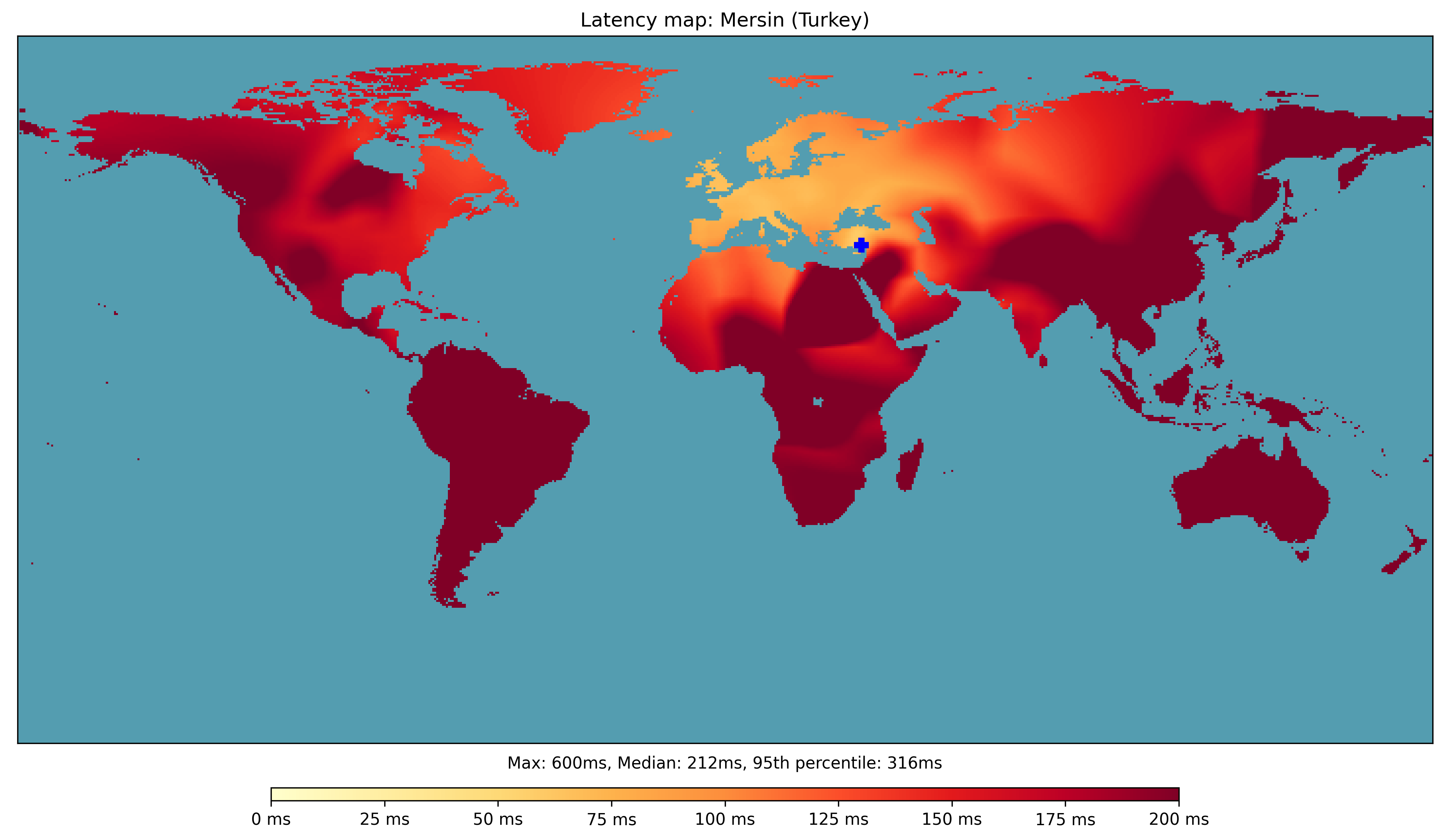
With the above formula, we can pick a specific location in the world, estimate its latency to the rest of the world and plot the results as a map. I will call this a "latency map" for the rest of the article.
As a demonstration, here's the latency map of the world from where I grew up, Mersin (look at the blue plus sign near the centre of the map). As you can see, its connectivity to Europe and even to North America is better than parts of the Middle East, North Africa or South Asia even though they are geographically closer.
Cloud Regions
Interestingly, there's no easily-accessible source on AWS datacenter locations. Instead, I passed their per-region endpoints through an IP Geolocation service. Excluding AWS China, I ended up with locations of 22 regions that are available for us.
At this point, we can calculate the latency maps of each AWS region, and rank them according to their 95th percentile latency. The reason that I choose 95th percentile rather than median is that I think optimizing for 95th percentile should reduce the number of outliers.
To me, it was surprising to find out that the best region for single-region setups (or the primary region for a multi-region setup) is West Europe. On top op having decent coverage of North America, it is also closer to South Asia.
Another curiosity is that us-east-1 seems to be much better than us-east-2. Tha latter does not even show up in the top 10 as its 95th percentile latency is 374ms. This might be an artefact of the ping dataset I am using, but requires more investigation.
Multi-region Setups
AWS has multiple options to route clients to the region that has the lowest latency to them. I do not think we have detailed publicly available information on how AWS decides on the "best region" for each client, but as they are likely to be more accurate than this article I think I can safely assume that every client can magically connect to the region that provides the lowest latency. If this assumption is correct, we can combine the individual latency maps for each region with a simple pairwise minimum operation to calculate the effect of having a multi-region setup.
With this ability in hand, we are only left with a search problem of finding the best set of regions according to worldwide 95th percentile latency.
Long things short, here is the result. Keep in mind that you can tweak the number of datacenters using the selectbox.
One trend you can easily notice is the proliferation of ap-northeast-3 (Osaka). Apparently once one has a region in US or Europe, the most neglected part of the world becomes east Asia and Australasia. A presence in Japan has the greatest effect to those areas, and on top of that it slightly helps the west coast of North America.
At this point, it's also useful to see how the number of regions affects the latency:
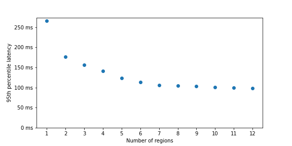
As you can see, we get to the point of diminishing returns very quickly. It is hard to justify a new region after about 4 or 5 regions.
Conclusion
Hopefully the above data would either directly help you to choose the region for your next project, or at least suggest a way to estimate the latency impact. Personally, I learned a couple of things:
- Latency between two regions does not always correlate with distance.
- Most internet users are in Asia, and
ap-northeast-3is a good choice there. - It's hard to have South American, African or Australiasian users have a good experience without having dedicated regions on those continents (
sa-east-1,af-south-1andap-southeast-{2,3}) - When optimizing latency for a cloud deployment, if the audience is all internet users:
- As a primary region, use
eu-west-2. - A good second region is
ap-northeast-3. - Then you can add either
ca-central-1orsa-east-1.
- As a primary region, use
Let me know if you have any comments, questions or requests.
Appendix: Costs
AWS regions also differ in their pricing, and the way they differ varies based on the exact service to look at. Although this article focuses on latency, I also wanted to quickly point out the cost differences.
I observed that computing is often the most costly part of cloud setups; so as a proxy metric for the cost of a region, I picked Fargate vCPU cost. As you can see, for some regions the cost difference can be very significant.
| Region | Fargate vCPU cost per month (USD) |
|---|---|
| us-west-2, us-east-2, us-east-1, eu-west-1 | $29 |
| ap-south-1 | $31 |
| ca-central-1, eu-north-1 | $32 |
| us-west-1, eu-central-1, eu-west-2, ap-northeast-2 | $34 |
| eu-west-3, eu-south-1, ap-southeast-2 | $35 |
| ap-southeast-3, ap-northeast-3, ap-southeast-1, ap-northeast-1 | $36 |
| me-south-1 | $38 |
| af-south-1 | $39 |
| ap-east-1 | $40 |
| sa-east-1 | $50 |
References
[1] Center for International Earth Science Information Network - CIESIN - Columbia University. 2018. Gridded Population of the World, Version 4 (GPWv4): Population Count, Revision 11. Palisades, New York: NASA Socioeconomic Data and Applications Center (SEDAC). https://doi.org/10.7927/H4JW8BX5. Accessed 27 July 2022.
[2] World Bank. "Individuals using the Internet (% of population)." World Development Indicators, The World Bank Group, 2015, https://data.worldbank.org/indicator/IT.NET.USER.ZS. Accessed 21 July 2022.
[3] WonderProxy. "A day in the life of the Internet" 2020. https://wonderproxy.com/blog/a-day-in-the-life-of-the-internet/. Accessed 7 August 2022.
HomeThis work is licensed under a Creative Commons Attribution 4.0 International License.